GOOD DESIGN AWARD 2020 YEAR BOOK
グッドデザイン賞2020イヤーブック
Design Award Yearbook
デザイン賞の年鑑
A sculptural form of stripped-back simplicity, imbued with the year’s symbolic colour
無駄を削ぎ落とした彫刻的な形状に、その年を象徴する色を
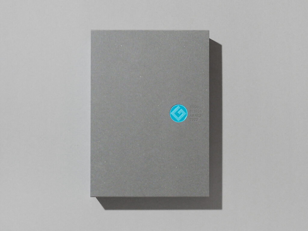
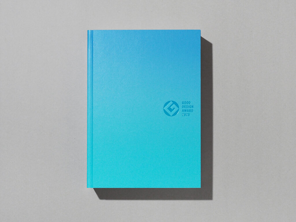
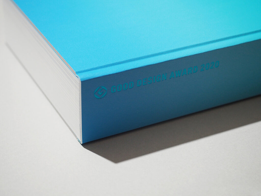
As a yearbook documenting Japan’s most prestigious design award, the binding aims for a minimal composition, stripping away excessive ornamentation. To maintain pure information, the basic format is strictly fixed each year. The typography is limited to just two typefaces: "Chū-Go BBB" and "Helvetica".
The book's structure adopts a "Bradel binding" (German-style binding), where the head, tail, and fore-edge are trimmed along with the cover to create a flush, seamless finish ("Tsuraichi"). This creates an impersonal, sculptural presence.
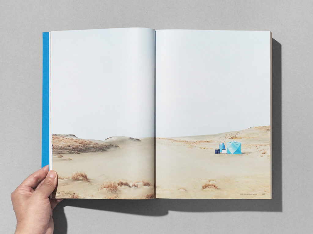
In contrast to this framework, the "colour of the cover" and "title page design" express the individuality of each year. The characteristic colour of that year's Grand Award-winning work is reflected as a symbol of the entire volume, with graphics on the opening pages inspired by the winner. The design seeks to quietly encapsulate the creative energy of the era within the form of a single object.
日本を代表するデザイン賞の記録を収める年鑑として、装丁は極限まで装飾を削ぎ落としたシンプルな構成を目指した。 情報の純度を高めるため、基本となるフォーマットは毎年固定し、使用する書体も「中ゴシックBBB」と「Helvetica」の2種類に限定。
造本は、天地と小口をカバーごと断裁して表紙と中身を面一(つらいち)に揃えるドイツ装を採用し、無機質で彫刻的な佇まいを形作った。
この骨格に対して、「カバーの色」と「トビラのデザイン」でその年ごとの個性を表現している。 その年のグッドデザイン大賞を受賞した作品が持つ固有の色を、年鑑全体の象徴としてカバーに反映。巻頭のトビラにも受賞作をイメージしたグラフィックを展開している。 時代が放った熱量を、一冊の書物の中に静かに封じ込めるような設計を心がけた。
A4+ / Hard Cover / 948 pages
Book Design: Masashi Tentaku, Hiroshi Homma
Publish: Sendenkaigi
Issue: Japan Institute of Design Promotion
2021
A4変形判/上製本/948ページ
ブックデザイン:天宅正、本間洋史
出版:宣伝会議
発行:公益財団法人日本デザイン振興会
2021年