TOMAKOMAI CITY SYMBOL MARK
苫小牧市シンボルマーク
Visual identity for an industrial city
工業都市のシンボルマーク
A dynamic identity capturing the city’s multifaceted character through rotation
回転することで、都市の魅力を多面的に伝える
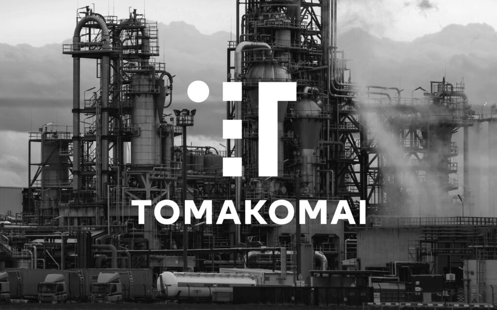
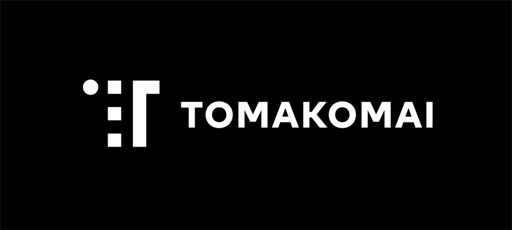


A competition entry for the symbol mark of Tomakomai, my birthplace in Hokkaido. Tomakomai is a prominent industrial city with a population of approximately 170,000, driven by the paper manufacturing industry.
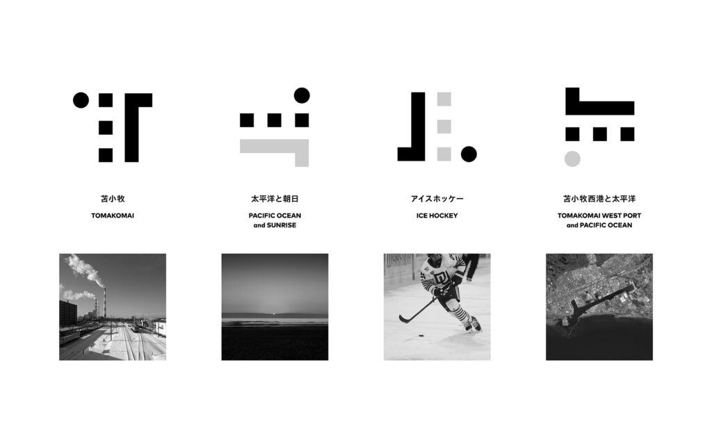
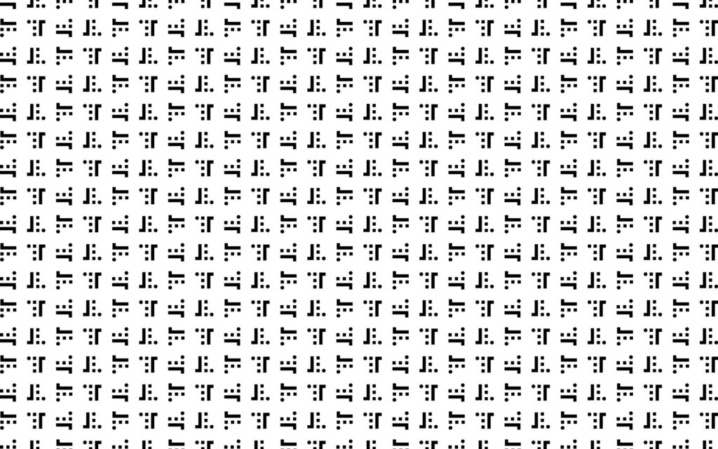
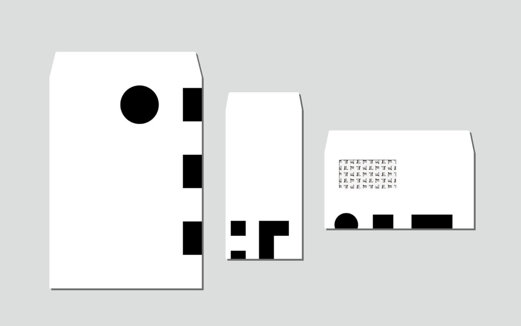
The proposed mark is structured around the letter ‘T’, the city’s initial. It is designed to be rotated, with each 90-degree turn revealing a distinct local icon: the sunrise over the Pacific, ice hockey, and the excavated port. By allowing a single form to shift its meaning, the design captures the diverse and dynamic character of the city.
Note: This work was a competition entry and is not an officially adopted mark.
自分の出身地である苫小牧市のシンボルマークのコンペに応募した作品。
苫小牧市は人口約17万人の、製紙業を基幹産業とする北海道の工業都市である。
提案したシンボルマークは、苫小牧市の「T」を基本の形としながら、90度回転するごとに「太平洋から昇る朝日」「アイスホッケー」「掘込港」という街を象徴する異なるモチーフが浮かび上がるよう設計した。一つの造形が姿を変えることで、街の多様な個性をダイナミックに表現している。
なお本作品は公募に応募したもので、実際には使われていない。
Design: Hiroshi Homma
2023
デザイン:本間洋史
2023