DIC KAWAMURA MEMORIAL MUSEUM OF ART Leaflet and cards
DIC川村記念美術館 リーフレット/会員証
Museum Membership Guide and Member's Cards
美術館の会員案内と会員証
Translating the colours of masterpieces into functional design
名画の色彩を、機能的なデザインへ落とし込む
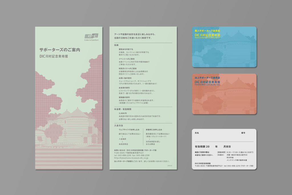

Design of the information leaflet and member's cards for the membership system (Supporters) of the DIC Kawamura Memorial Museum of Art.
The main visual features an illustration of the museum's exterior, drawn using only straight lines. The colour palette was picked from Andy Warhol's Marilyn, one of the key works in the museum's collection. These colours were adjusted for the final design to ensure legibility and to minimise the risk of misregistration during the printing process.
The museum is operated by DIC Corporation, a chemical company that manufactures products such as printing inks. With this background in mind, particular attention was paid to the quality of the printed finish.
DIC川村記念美術館の会員(サポーターズ)システムについて案内するリーフレットと会員証のデザイン。
直線のみで描かれた美術館外観のイラストを使用。色は収蔵作品の1つであるアンディ・ウォーホルの『マリリン』からピックアップしたものを、可読性や印刷の仕上がり(版ズレのリスク)などを考慮して再設計した。
ちなみに美術館の母体となっているDIC株式会社は印刷用のインキなどを製造する化学メーカーである。

Design: Hiroshi Homma
Illustration: Hiroshi Homma
2020
デザイン:本間洋史
イラストレーション:本間洋史
2020年