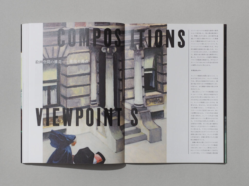
EDWARD HOPPER
エドワード・ホッパー作品集
Book design for a monograph of the iconic American painter
アメリカを代表する画家の作品集のデザイン
Typography carries the atmosphere of a certain time and place
タイポグラフィが、ある時代、ある場所の空気を運ぶ
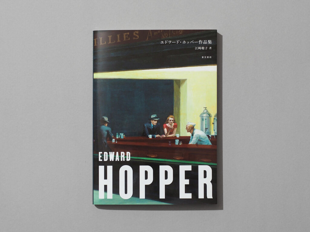
A monograph of the iconic American painter, Edward Hopper.
The author, Satoko Ezaki, provided a single, succinct brief: "Make it hard-boiled." My mind immediately turned to Raymond Chandler. If the man sat in the diner in Nighthawks—the masterpiece featured on the cover—were Philip Marlowe himself, he might well have a tabloid tucked under his arm. Inspired by this image, I decided to draw from the aesthetic of American tabloids of that era.
The Latin typeface is a digital revival of the wood type found in 1930s and 40s American tabloids. I opted for generous letter-spacing to lend the design a more contemporary feel.
Whilst book titles are typically positioned in the centre or towards the top, I chose to layout the title at the foot of the cover. To reflect Hopper's style, so often characterised as "cinematic", I approached the design as if I were composing a film poster rather than a conventional book jacket.
アメリカを代表する画家、エドワード・ホッパーの作品集。
著者の江崎聡子さんからは、1点のみ「ハードボイルドに」というリクエストをいただいた。ハードボイルドといえばレイモンド・チャンドラーだろうか。表紙に使った『ナイトホークス』のダイナーに座る男性がフィリップ・マーロウなら、その小脇には当時のタブロイドが抱えられているかもしれない。そんな想像から、当時のタブロイド誌に着想を得ることにした。
使用した英文書体は、1930〜40年代のアメリカのタブロイド誌で使われていた木活字をデジタル書体として復刻したもの。現代的な表情を加えるため、あえて字間は広めに組んでいる。
表紙をデザインする場合、タイトルは中央や上方に置きがちだが、今回はあえて下部にレイアウトした。しばしば「映画のワンシーンのよう」と評されるホッパーのスタイルを活かすため、「本の表紙」というより「映画のポスター」を制作するつもりでデザインを仕上げた。
A4 / Soft Cover / 192pages
Book Design: Hiroshi Homma
Publish: Tokyo Bijutsu Co.,Ltd.
2022
A4/並製本/192ページ
ブックデザイン:本間洋史
出版:東京美術
2022年